
A data model for investigating diversification
GPT-4 hallucinations are a small price to pay for the benefit of never feeling totally stuck in the code. The net effect is optimism: if my code partner clears the technical hurdles, I get to imagine.

This post refers to code we (me and GPT-4) wrote here.
The ultimate coding partner
This week’s post is brief because I’ve spent most of my weekend time writing and editing code with GPT-4 as my coding partner. I had an epiphany about the LLM related to hallucinations. As a daily user, I am aware that hallucinations can be frustrating.
But my epiphany is that the cost of hallucinations is outweighed by the LLM’s delusion of invincibility because GPT-4 will tirelessly attempt to answer any and every question with solid skills and unparalleled conversational continuity. Its epistemological essence is both a bug and a feature. Because GPT-4 assumes there is (almost) always an answer, as its coding partner, I am never fatally stuck. As a mediocre coder, I previously got stuck often and (because time is a big factor), getting stuck is (was?) the ultimate problem for me. But GPT-4 never gets stuck. So we don’t get stuck.
This engenders optimism. As a coder, it makes me feel like Neo in the matrix: I may not know Kung Fu, but I can learn Kung Fu. The key is that GPT-4 will gladly engage with me in a never-ending, never-totally-stuck conversation. This is strangely close to feeling like the only real limit is my imagination. (This was not the case before GPT-4 with respect to coding: before GPT-4, my limits were acutely tangible.)
I’ve been wanting to write code that will enable me to analyze and interpret asset diversification. To do that properly, I procrastinated because I didn’t have a plan for the data structure. I wanted a data structure that I can scale adaptively to the investigation. GPT-4 helped me structure an execute the plan. Previously, I’d use google to help with syntax and grammar. GPT-4 is a profoundly different technology: I’ve gradually realized that you can engage the LLM on multiple levels of abstraction. This was the first time that I literally partnered with GPT-4. I discussed the framing of the solution. We proceeded step-by-step. We references prior drafts. After the data model worked, it helped me refactor sections of the code (refactoring shrunk the code to about half its original size, as “we” together collapsed redundant routines).
Visualizing diversification
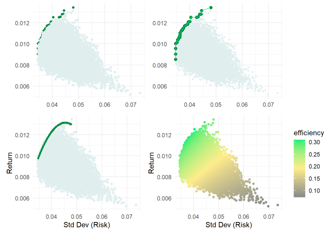
Below is a (set of four variations on) the first version of the essential risk/return plot. Via Monte Carlo simulation—where I set the number of simulation to 20,000—this random allocates the investment to five sectors (Tech, Health, Staples, Energy, Financials). This is a naïve simulation because the random weights allocated among the five sectors are independently random; they are not informed by return or risk expectations. The random heart of this (version 1.0) simulation is a dataframe (random_weights_df) of 20,000 columns and one row for each weight (0 to 100%) allocated to each of the stock/ETFs in the set:
for (i in 1:num_simulations) {
        weights <- runif(num_stocks)
        weights_df[, i] <- weights / sum(weights)
    }
The simulation outcome is an X,Y pair {risk = standard deviation, return} that is a function of each sector’s return (a linear, weighted function) and the portfolio’s volatility as a function of the historical correlation matrix. The fun part, for me, is visualizing the results. At this early stage, I quickly experimented (see below which correspond to ggplot objects p1 to p4 in my code) with (i) a different color for the efficient points, (ii) drawing a line that connects the slightly larger efficient points, (iii) a polynomial regression line fitted to the efficient points, and (iv) a gradient scale based on a temporary Sharpe ratio.
The data model
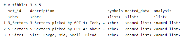
I’m happy with the data structure. Everything is contained in stock_sets which has one row for each set of assets. Initially, it has only three rows. And the columns are simple and easy to understand:
set_id and description
symbols: the set of tickers in the set. The above visualization—because it simulates on the second row, has this character vector of tickers: c("XLK", "XLV", "XLP", "XLE", "XLF")
nested_data: a list column that holds all of the period (log) returns. For example, the second item (row) is itself a list of 3 items: a dataframe of daily log returns, a dataframe of weekly log returns, and a dataframe of monthly log returns.
analysis: a list column that holds the historical analysis. Its structure mirrors the nested_data. For example, the second item (row) is itself a list of 3 items: daily, weekly, and monthly. Each of this is another list: volatilities and average returns (tibble vectors); correlation matrix, and average correlation (the off diagonal average correlation as a rough measure of diversification).
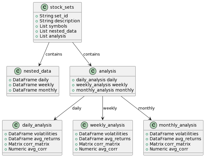
Here’s a class diagram of stock_sets.
A modular, scalable approach to the problem
This approach to the problem satisfies my twin goals for something that’s scalable and flexible (modular). The “problem” is a want to investigate and visualize diversification in a meaningful way; for example, daily volatility and correlations don’t matter to many investors nearly as much as monthly volatility. Specifically,
First I can define any number of different sets and each set will be a single row in stock_sets (see first chunk)
By means of Matt Dancho’s awesome tidyquant package, refactored retrieval of log returns is brief and elegant (see second chunk) and stored in nested_data.
Historical analysis (volatilities, average returns, correlation matrix, and average correlation) is stored in analysis (see third chunk)
The simulation engine is defined by three functions: get_random_weights, port_sim (which performs the essential matrix algebra), and run_sims. See fourth chunk.
Running the simulation is separated so that our selection is explicated. See fifth chunk.
Visualize. See sixth chunk.
More to come
I hope that was interesting. Stay tuned for the next iteration!