
Clustering with the k-means algorithm
This unsupervised learning technique clusters observations by feature similarity (distance)

The code associated with this post is located here at my data science site.
Contents
Retrieve dataset of stock fundamentals
The key steps:
Scale and select features
Select number of clusters via elbow method, and
Perform k-means via kmeans()
Inspect and visualize clusters
In October I showed the lazy classifier called k-nearest neighbors (k-NN). K-NN is supervised learning because the observations are labeled; supervised learning implies the presence of a target variable. On the other hand, the k-means learner is unsupervised because observations are clustered without reference to any target variable(s). For example,
In my k-NN illustration, the target variable was a binary (did the borrower default or repay?). We predicted whether a new borrower might default based on a “vote” of its nearest neighbors. We tally the labels of the nearest neighbors; if most of the neighbors defaulted, we predict the new borrower by association will default.
In this current illustration, I seek to arrange similar stocks into clusters of nearby neighbors, but the observations are not labeled (at least beforehand). The clusters are a function of discovered similarity. As such—as there is no target variable—I am not predicting an outcome. Instead, I hope to discover a pattern.
They have in common the concept of similarity measured by distance to one’s neighbor: in both approaches, an observation (with many features) is similar to another observation if it is nearby; i.e., if the distance between them is shorter rather than longer. In k-NN, the nearby neighbor “casts a vote” with respect to the target variable. In k-means clustering, the nearby neighbor is merely similar by virtue of proximity.
Retrieve dataset of stock fundamentals
To retrieve a fundamental dataset, I decided to try Tiingo.com for the first time (at a cost of $0 per month, their starter plan meets my price target!). Tiingo’s screener is intuitive. I was able to download various screens of cleaned data to CSV file format, including this broad dataset (XLS file) that roughly constitute the S&P 1500.
In selecting candidate metrics, I looked to represent four groups: profitability, growth, valuation and risk metrics. These are my specific candidate metrics:
stocks1500 <- stocks1500 |> rename(
    market_cap = 'Market Cap',
    div_yield = 'Dividend Yield',
    gross_margin = 'Gross Margin',
    revenue_growth = 'Revenue Growth (QoQ)',
    rho_sp500 = 'Correlation to S&P 500',
    volatility = '1 Year Volatility',
    pe_ratio = 'P/E Ratio',
    debt_equity = 'Debt/Equity (D/E) Ratio',
    ROE = 'Return on Equity (ROE)',
    ROA = 'Return on Assets (ROA/ROI)',
    TSR_1year = '1 Year Return',
    rho_treasury = 'Correlation to U.S. Treasuries',
    enterprise_value = 'Enterprise Val',
    pb_ratio = 'P/B Ratio')
However, I quickly discovered that k-means clustering feels a lot like exploratory data analysis (EDA). I’m new to unsupervised learning and, so far, I found this experimenting to be a bit frustrating (I couldn’t find an organizing principle or operative logic). The majority of my multi-feature clusters were not informative. I will defer the challenge of multi-dimensional features to a future post. For this post, I settle on an easier two-feature illustration.
Further, after removing five outliers (e.g., Amazon is consistently an outlier), I filtered the larger capitalization stocks; i.e., I am including only stocks above the mean:
# filtering by market cap: important reduction here!
df <- stocks1500 |> filter(market_cap > mean(stocks1500$market_cap))
numeric_cols <- df |> select_if(is.numeric)
At this point, the dataframe (df) that I will analyze contains 282 companies with a market capitalization of at least $25.0 billion because that’s happens to be the mean of the total dataset’s capitalization.
The steps: Scale and select features; Select number of clusters, and perform k-means via kmeans()
Scale (e.g., standardize) and select the dataset’s numerical features
Select the number of clusters via elbow method
Run the algorithm to determine each observation’s membership
The essence of the basic k-means cluster algorithm is similarity. A cluster is a group of similar observations. When the features are numerical, the obvious (but hardly only) measure of similarity is Euclidian distance:
If I don’t scale the features, this distance measure will be distorted by the features that happen to be represented by large values. For example, P/E ratios (in the 15 to 40 range) will totally dominate growth measures and dividend yields (in the zero to 0.1X range). Therefore, we almost certainly want to scale the features.
After scaling all the numerical features, I selected two metrics. I decided on risk and reward:
selected_features <- c("volatility", "TSR_1year")Next, I need to choose the number of clusters. I can approach this choice pseudo-objectively via the elbow method. My code generates a plot of within-group heterogeneity via sum of squares. The within-cluster sum of squares (WSS) is sum of squared distance between each observation and its cluster’s center (aka, centroid). Here is the plot for my two features (volatility and 1-year TSR):
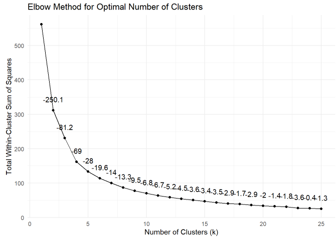
I added the slope at each segment; eg, from 4 to 5 clusters is a slope of -28. Visual inspection suggests we might perceive the elbow point to be located at 5 or 6 clusters. I decided to use 5 clusters. As you can see in the code, the kmeans() function itself is one line:
set.seed(9367) # Set a random seed for reproducibility
# Color palette
# location (ex post): top-middle, bottom-middle, bottom-right, left, top-right custom_colors <- c("blue1", "darkorange1", "firebrick3", "cyan3", "springgreen3")

numeric_data <- df_std |> select(all_of(selected_features))
# based on the elbow method's so-called
# elbow point but ultimately is discretionary
num_clusters <- 5
kmeans_result_n <- kmeans(numeric_data, centers = num_clusters, nstart = 25)
Inspect and visualize clusters
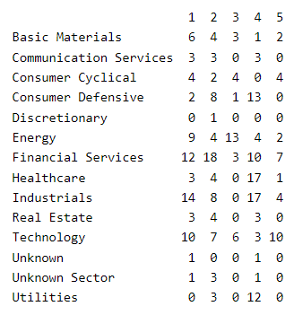
Here is a view of the clusters by sector; e.g., 12 of the 15 utility companies are located in cluster #4:
It’s easy to visualize a two-feature k-means cluster. I think my outcome is rather interesting. There’s a low-risk, low-reward cluster (#4 in cyan3) that is next to a higher-risk, higher reward cluster (#1 in blue1) and finally the highest-risk, highest reward cluster (#5 in springgreen3). Mostly below the regression line are less desirable clusters: #2 in darkorange1 and #3 in firebrick3.
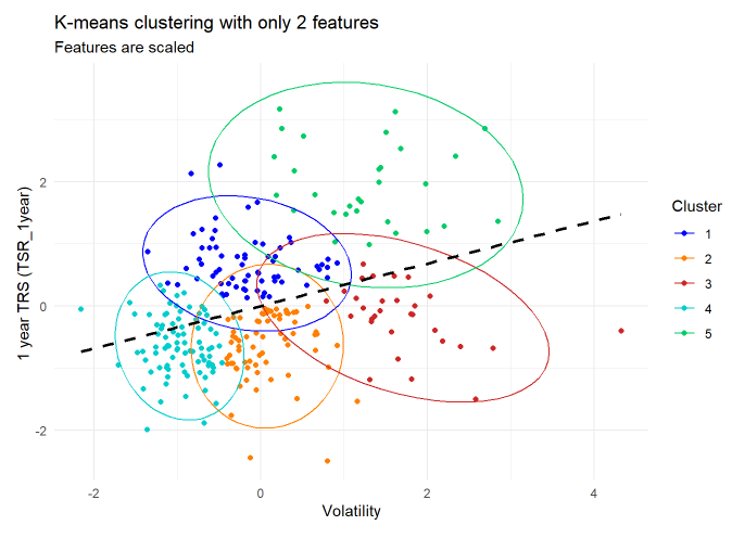
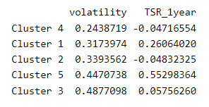
I showed the regression line to make a point: in this case, the clusters are a more imaginative way to express the relationship between risk and reward. If I sort by volatility (lowest to highest), here are the five centroids:
Summary
I do like Brett Lantz’s description of clustering:
“Clustering is somewhat different from [the] classification, numeric prediction [where] the goal was to build a model that relates features to an outcome … In contrast, the goal of clustering is to create new data. In clustering, unlabeled examples are given a new cluster label, which has been inferred entirely from the relationships within the data. For this reason, you will sometimes see a clustering task referred to as unsupervised classification because, in a sense, it classifies unlabeled examples. The catch is that the class labels obtained from an unsupervised classifier are without intrinsic meaning.” — Chapter 9, Machine Learning with R (4th Edition) by Brett Lantz
But I will admit that here, in my first engagement with k-means clustering, I did not really succeed in discovering actionable insights. I find the patterns of the five clusters interesting, but I’m not sure if I can do anything with them (that I couldn’t do upon viewing the raw scatterplot).
Hopefully, I can discover something actionable when I try multi-feature clustering. See you next time!