


Linear (univariate) regression is the gateway machine learning technique
Influencers and outliers. Model diagnostics include linearity, homoskedasticity, normal residuals and autocorrelation

Contents
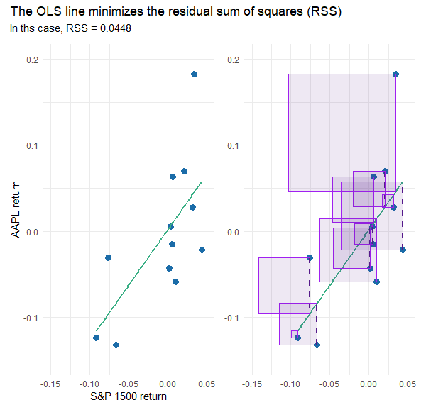
The OLS line minimizes the RSS
Influences and outliers (Cook’s D)
Regression as AAPL’s beta
Model diagnostics (Linearity, homoskedasticity, outliers, normal residuals)
Autocorrelation test
I think of linear regression as the gateway to machine learning. I hesitated to write about this technique because it is already extensively covered in articles and books. In the FRM, we studied regression techniques for a decade (as the predominant econometric technique) before machine learning was formally added to the syllabus. I hope to add value by sharing code snippets that highlight an application in finance as an excuse to briefly illustrate model diagnostics. As such, this is hardly a deep theoretical dive, but instead a quick tour of (my view of) the highlights.
Here is the code I wrote for this post. Because regression is well-supported in R and its packages, most of my code is actually devoted to the visualizations.
The motivating example is based on a setup—with actual data—in one of my FRM practice question.
The dataset is monthly returns over a six-year period; i.e., n = 72 months. The gross returns of Apple’s stock (ticker: AAPL) were regressed against the S&P 1500 Index (the S&P 1500 is our proxy for the market). The explanatory variable is SP_1500 and the response (aka, dependent) variable is AAPL.
The OLS line minimizes the RSS
Before I show you the full dataset, I sampled 12 months randomly (from among the full set of 72 months) just so that I can illustrate the ordinary least squares (OLS) method used to generate the straight line. Code is here. On the left (below) is the scatterplot: AAPL’s returns versus the S&P 1500. The vertical distance from each observation to the line is called the residual. On the (below) right each residual is visually squared: the area of each rectangle is the square of the residual. The sum of these squares is the residual sum of squares (RSS). The OLS line is the line that minimizes the value of RSS. Visually, the green line is the solved-for line that implies the smallest sum of the area of the rectangles.
Influences and outliers
The same 12 months are numerically displayed below. Note they are sorted by the independent variable (S&P 1500 return); they are not sorted chronologically. The 11th row (S&P 1500 = +3.42% and AAPL = +18.72%) contains the largest residual of +13.72% because the actual value (AAPL’s monthly return of +18.27%) far exceeds the regression line’s predicted value of +4.55%.

The Cook’s distance (final column above) is a measure of an observation’s influence. Notice that the second row’s observation has more influence than its residual might suggest; i.e., it ranks second in influence (0.28504) but fourth (0.00426) in contribution to RSS. Let’s see what happens if we remove the most influential observation (with a Cook’s distance of 0.45582):
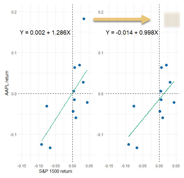
The slope dropped from 1.286 to slightly less than one (i.e., 0.998). This shows the importance of distinguishing between influencers and outliers. Why don’t we just retain the influencers and drop outliers?
Because context matters. What’s our goal: is it to explain a dynamic or predict the future? What does our domain say about the findings (should we investigate the outlier, maybe it’s bad data)? Much turns on the sample we happened to retrieve. In re-sampling and wrestling with the data, we might want to transform feature(s) or decide the linear model is not a good fit at all.
Why do we sum the squares of the residuals to fit a line?
There are two intuitive reasons: One, by transforming negative residuals to positive squares, we’re gauging magnitude. Two, to “penalize” a line for large “errors.” Okay, fine, but these ends could be achieved via other means …
The important theoretical reason is that—if we use OLS to generate the line—the Gauss-Markov theorem assures us desirable coefficients. Specifically, the estimates are the best linear unbiased estimators (BLUE). In short, OLS uses RSS to get us a line with BLUE coefficients1.
Regression as AAPL’s beta
Now I will re-run the regression on the full dataset that contains six years (n = 72 monthly observations). Code here. Assuming the S&P 1500 is a proxy for the market, this is a regression for the purpose of estimating Apple’s beta.

My code shows the typical model outputs. For my practice question, I generated a formatted table with the awesome gt package …

… which informs my practice question:

You can see: our sample regression function returns a beta of, β(AAPL, S&P1500) = 1.270. We can query a null hypothesis that Apple’s beta is one. The standard distance from the observed 1.270 to hypothesized 1.0 is only (1.270 - 1)/0.216 = 1.25. We cannot reject the two-sided null H(0): β = 1.0, or even the one-sided H(0): β ≤ 1.0, with any realistic level of confidence. But notice the displayed p-value is very low (because the display t-stat is high): the 1.270 coefficient is significant because it is significantly different than (distanced from) zero. The table’s implicit null is H(0): β = zero. This is a case where that typical test is not the test we want.
Model diagnostics
We can run many different diagnostics, but I’m not convinced that we need more than a few. From the terrific performance package, I’ve selected four via a single function call (code here):
check_model(model_72, check = c("linearity", "homogeneity", "outliers", "qq"))
I selected these four charts because they map nicely to the assumptions of the classic linear regression model (i.e., the CLRM that utilizes OLS to achieve desirable BLUE coefficients):
The Linearity plot is a visual check of our most basic assumption: the model is linear and the conditional mean of the error is zero, E(ε|X) = 0.
The Homogeneity of Variance (aka, scale-location) plot is a check of homoskedasticity which is the assumption of constant variance. We can also look for non-constant error variance (i.e., heteroskedasticity) via the first plot but this plot amplifies differences by rooting the absolute value.
The Influential Observations confirms that large outliers are unlikely. Recall the small sample’s (n=12) highest Cook distance was 0.45582. This plot’s dashed lines tell us not to worry unless an observation has influence greater than 0.50; and none of the observations in this full set (n = 72) fall above/below that bound.
The Normality of Residuals plot affirms our expectation that the observations are independent. If {X,Y} are i.i.d. → the errors are independent and normal.
The last assumption may seem academic but it’s huge: a univariate linear regression underfits by design! We know the regression omits variables. But we make the grand assumption that the error term impounds all of the variables that do influence the dependent but are not included in the model; i.e., all other features are a sort of catchall bin. We make the profound (and probably unrealistic) assumption they are independent. But if they are independent, the magical CLT justifies their normality. Put another way, it’s okay to underfit if the many omitted variables are independent because they they will wash out in the error term.
Autocorrelation
We just discussed normal residuals, but what about independent residuals? Our last diagnostic check is for autocorrelated residuals. In my code, you’ll see that I first just ran check_autocorrelation() which didn’t give me much information. So I plotted each residual against its 1-lag residual:

That appears a bit negative. Indeed , the line’s slope is -0.218861.
Call:
lm(formula = Residuals ~ Lagged_Residuals, data = residual_data)

Coefficients:
     (Intercept)  Lagged_Residuals
        0.001015         -0.218861
But the correlation is small at 0.04872. At this point, I found the new desk package which enables a specific Durbin-Watson test:

Notice the test statistic is dw = 2.3979. If dw = 2.0, we have no autocorrelation, ρ = 0. If dw = 0, we have perfect positive autocorrelation. If dw = 4, we have perfect negative autocorrelation. In the first test above (dir = “right”) the one-sided null hypothesis (i.e., that d ≤ 2 → ρ ≥ 0 ) is rejected with 95% confidence. We barely accept there is negative autocorrelation.
But the two-tailed test, with a p-value of 0.0821, does not reject the null hypothesis (i.e., that d = 2 → rho = 0). If we desire high confidence, we “accept” there is no autocorrelation. I think this is consistent with the plot’s slight negative slope and lack of evidence for a strong violation of the independent residuals assumption.
I hope that was interesting. Thank you for reading!
I’m using estimator, estimates, and coefficients loosely as synonyms. Just like I’m using error and residual as synonyms. My loose language is not really correct. In theory, there is a single unviewable population regression function (PRF) that we try to infer by various, random sample regression functions (SRF). Much like we might infer a six-sided die’s true (population) average value of 3.5 by observing sample averages (e.g., average of ten rolls is 3.7; average of next ten is 3.4, etc) that fluctuate around that value. The SRF has a residual, but it varies with each different sample; the residual is an estimator of the error term in the PRF.
I think the most important thing that I learned from this underlying theory is an understanding that an estimator is just a recipe (among several possible recipes) that generates an estimate (or coefficient) for us. It’s not like there is always one best estimator. Rather, estimators have properties, and often it’s a matter of which properties we seek.