
Logistic regression
How to simulate an insurance customer dataset; fit and evaluate a logistic regression model; interpret coefficients; and visualize marginal effects. Featuring two killer packages: simdata & ggeffects

Contents
Simulated dataset (insurance customers) with simdata package
Logistic regression model
Evaluation with confusion matrix
Visualizations: typical and marginal effects with ggeffects package
How to interpret logistic coefficients
This post elaborates on my (Quarto) code notebook located here on my data science site called finedtech.io. Last week I gave readers a fast tour of univariate linear regression. This week, my goal is to demonstrate logistic regression with a simulated dataset of 1,000 insurance customers; I then split this into 90/10% training/test sets. The target variable is churn (a binary variable where 0 = customer will not churn, and 1 = customer will churn) and each customer has seven features: loyalty (for how many years has the company served the customer?), bundle_b (1 =customer owns a bundle), pricejump_b (1 = customer recently experienced a rate increase), premium (in dollars), age, income (in $000s), and mobile (a binary where 1 = customer accesses the mobile app).
You’ll see my code uses several packages, most of which I was already familiar. However, when I started to code the tutorial, I was not aware of either the simdata or ggeffects package. In each case, I had hit a small obstacle, and went looking for packages to help. In both cases, package authors have built something beyond my imagination! This is another reason that R is such a great language.
What is a logistic regression?
The job of a logistic regression model is to estimate a probability (from zero to 100%). A multivariate linear regression model is a linear combination of coefficients (where β0 is the intercept) as given below where z is the predicted value:
The z above won’t be a probability, but the following logistic transformation ensures the target (aka, dependent) is a probability:
In this way, the model (fitted to training data) when applied to test data will return a vector of probabilities. A simple decision rule—e.g., if probability > 0.50—classifies the test observation into an either/or binary; e.g., retain/churn, repay/default.
Simulated dataset (insurance customers) with simdata package
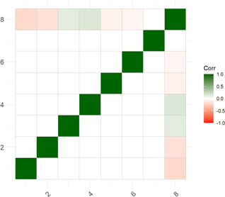
I looked first on Kaggle for an insurance example, but couldn’t find a convenient dataset for illustrative purposes. Then I discovered the simdata package by Michael Kammer; this might be my new favorite package. It is well-designed. As you can see in my code, I first designed an 8*8 correlation matrix where the last variable will be my dependent binary variable, churn. My matrix has a “light touch” with modest correlations for a few of the independent variables (and no pairwise nuances):
The simulation will generate a multivariate normal distribution. The fun part is defining a transformation() function. In my case, I decided to generate loyalty (in years) via inverse transformation into a beta function; e.g., given my {α = 2, β = 5} parameters, the beta’s mean is 2/(2+5) and multiplying by 30 implies a distribution with E[mean] of ~8.6 years ranging from zero to 30. For the premium (in $000s), I applied pnorm() to achieve a uniform distribution. For age, I scaled the random standard normal but applied cutoffs at [18, 80 years]. For income, I applied exp(z) to achieve a lognormal distribution. Isn’t this powerful and flexible?!
transformation <- simdata::function_list( loyalty = function(z)
    qbeta(pnorm(z[,1]), shape1 = 2, shape2 = 5) * 30,
    bundle_b = function(z) z[,2] > qnorm(0.7), #bundle
    pricejump_b = function(z) z[,3] > qnorm(0.8), # 80th for 20% probability
    premium = function(z) pnorm(z[,4]) * (2000 - 300) + 300, # premium
    age = function(z) pmax(18, pmin(80, z[,5] * 10 + 40)), #age
    income = function(z) exp(z[,6] + 4), #income
    mobile_b = function(z) z[,7] > 0, #mobile
    churn = function(z) z[,8] > qnorm(.8)
)
The resulting random dataset follows my specifications. The ggpairs() plot (below) omits the target variable (churn) where the diagonal displays each univariate distribution (e.g., bundle_b and pricejump_b are binaries, where bundle = does customer own an insurance bundle? and pricejump_b = has rate jumped on customer in the last year?), and you can see the pairwise correlation are nearly zero.

The simulation returns a plausible (albeit totally clean!) dataset:

Logistic regression model
Fitting the model to the training set is a single command …
model_sim_v2 <- glm(formula = churn ~ ., family = binomial(link = "logit"), data = sim_train)… and we’ll let the gt package deliver the results:
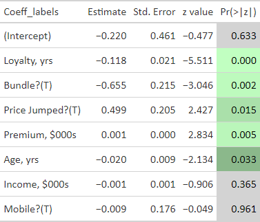
The results are somewhat expected due to the design of my correlation matrix. In particular:
My correlation matrix did intend loyalty (ρ = -0.20) and bundle (ρ = -0.16) to show significance, while pricejump (ρ = 0.12), premium (ρ = 15), age (ρ = -0.07), and income (ρ = -0.07) wanted to be light.
Yet the low correlation values reflect my intention to produce a somewhat realistic dataset, so I did not expect a super high performing model!
Evaluation with confusion matrix
The training dataset is 100 customers; I split the initial 1,000 simulated customers into 90% training and 10% testing. The model is indeed a mediocre classifier. At this point, let’s note that the logistic regression generates or predicts a probability as a function of the features. This is not itself classification. We classify by setting the probability threshold. The threshold defaults to 0.50 such that a predicted probability greater than 0.50 classifies the customer as somebody who will churn (churn = 1 refers to a customer who we predict will churn).
Shifting the threshold is an experiment in tradeoff between false positives (FP) and false negatives (FN)s, as you can see in my code. See wikipedia’s confusion matrix entry for definition. For example, in the second try, I lower the threshold and classify a probability (predict_test_probs) of greater than 0.32 as a customer who will churn (churn = 1):
predict_test_class <- as.factor(ifelse(predict_test_probs > 0.32, "TRUE", "FALSE"))Given this lower threshold, the model’s accuracy is 72% and sensitivity is only 5/(5+18) = 21.7%.

Visualizations: typical and marginal effects with ggeffects package
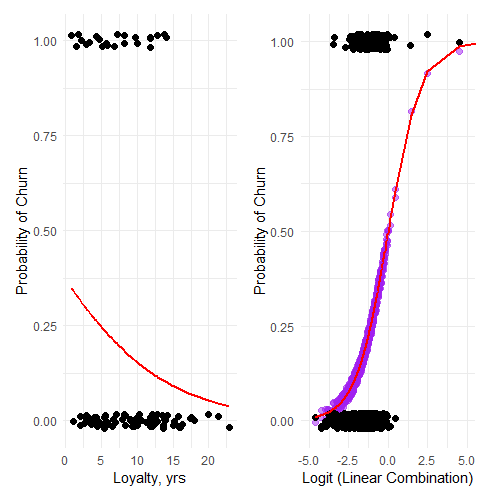
My first two visualizations are traditional for a logistic regression. On the left (below) is a plot of a single predictor (Loyalty, in years) versus the probability of churn. Importantly, all other features are held constant at their mean or mode (in the case of the binaries) value. The red line is the predicted probability while the (jittered) black dots are the actual observations: while the model predicts a a probability that is a decreasing function of loyalty, each customer either churned or did not.
On the right is a plot that took me a bit more time to create. The red line is the sigmoid (aka, logistic) function given by p = 1/[1 + exp(-z)] where z is the linear combination of all features. So this is the full view of the fit model (the red line) visualized against the outcomes. (I did append five observations to the right, in order to see the full shape of the sigmoid).
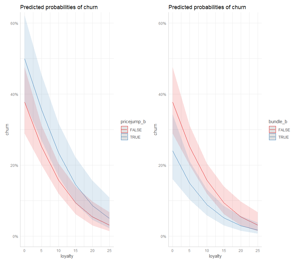
As I was struggling to find a better way to visualize, I discovered the amazing ggeffects package by Daniel Lüdecke and contributors. I’ll plan to spend more time with this package! Below is a plot of Loyalty’s marginal effect on churn, but notice how it is bifurcated by pricejump_b (on the left) and bundle_b (on the right). If the price has recently jumped, the churn probability is ~ 1X% higher (as indicated by the blue line and its confidence interval). If the customer owns a bundle, the blue illustrates how the churn probability is ~1X% lower.
How to interpret logistic coefficients
Before concluding, I want to briefly explain coefficient interpretation in the logistic regression.
The coefficient is the estimated change in log odds associated with a one-unit change in the feature (aka, predictor).
Where probability is given by p, odds = 1/(1-p) and log odds = log[1/(1-p)].
Per the end of my code, consider a customer with mean/mode values (including no recent price jump) across the features but loyalty of zero years. The model gives a probability of churn of 37.54%. Now let’s switch to pricejump_b = TRUE. That’s a one-unit increase in this feature (from 0 = FALSE to 1 = TRUE). This feature’s coefficient is 0.4984422. What is the revised probability?
Because Δlog(odds) = 0.4984422, Δ(odds) =exp(0.4984422) =1.6462. If p =37.54%, the odds are given by odds =p/(1-p) =0.6010 and we expect the odds to increase to 0.6010*1.6462 =0.9894. Because p =1/(1 + odds), that’s a revised probability of 1/(1+0.9894) =49.73%. Indeed, that’s what the model says!
Now let’s use this hypothetical customer and add a single year of loyalty:
Loyalty’s coefficient is -0.1179751 such that a one-year change in loyalty years (i.e., a one-unit increase) will multiply the odds by exp(-0.1179751) = 0.8887.
The odds of 0.9894 lower to 0.9894 * 0.8887 = 0.8793, which is a revised probability of 0.8793/(1 +0.8793) = 46.79% (down from 49.73%).
Finally, let’s add nine years of loyalty to this customer’s observation:
Loyalty’s coefficient is -0.1179751 such that a nine-year change in loyalty years (i.e., a one-unit increase) will multiply the odds by exp(-0.1179751*9) = 0.3458.
The odds of 0.8793 lower to 0.8793 * 0.3458 = 0.3040, which is a revised probability of 0.3040/(1 +.30340) = 23.31% (down from 46.79%).
I hope that was interesting and educational!